NYT Bestseller 2023 Analysis in R
- Lekha Mirjankar

- Jan 27, 2024
- 3 min read
Continuing with the NYT Bestseller analysis, since we have the desired dataset now, it's time to dive into the data and gather insights.
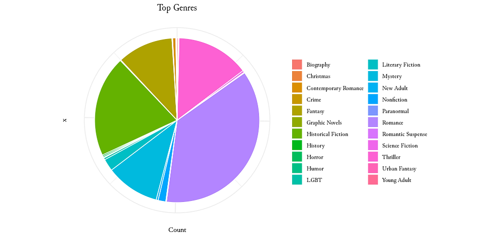
1. Top Genres
Let's identify the top genres. Calculate the genre counts and present the trends using a pie chart.
# Calculate the count of genres
top_genres <- NYT_df_combined_genre %>%
  group_by(Genre = Genre) %>%
  summarize(Count = n()) %>%
  arrange(desc(Count))

# Visualize
ggplot(top_genres, aes(x = "", y = Count, fill = Genre)) +
  geom_bar(stat = "identity", width = 1, color = "white") +
  coord_polar("y", start = 0) +
  labs(title = "Top Genres",
       fill = NULL) +
  theme_minimal() +
  theme(text = element_text(family = "Junicode"),
        plot.title = element_text(hjust = 0.5),
        axis.text.x = element_blank(),
        legend.position = "right")
Output:
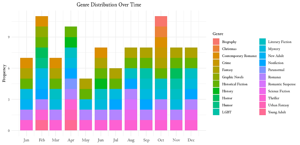
2. Temporal Analysis
By grouping data monthly and summarizing rankings, we visualize how genres distribution changes through the year.
# Round down the dates to the start of each month
NYT_df_combined_genre$YearMonth <- floor_date(NYT_df_combined_genre$PublishedDate, "month")

# Group data by month and summarize the rankings
monthly_data <- NYT_df_combined_genre %>%
  group_by(YearMonth, Genre) %>%
  summarise(AverageRank = mean(Rank))

# Visualize
ggplot(NYT_df_combined_genre, aes(x = PublishedDate, fill = Genre)) +
  geom_bar() +
  labs(title = "Genre Distribution Over Time",
       x = NULL,
       y = "Frequency",
       fill = "Genre") +
  scale_color_brewer(palette = "Set3") +
  theme_minimal() +
  scale_x_date(date_labels = "%b", date_breaks = "1 month") +
  theme(
    text = element_text(family = "Junicode"),
    plot.title = element_text(hjust = 0.5),
    axis.text.x = element_text(hjust = 0.5, size = 11)
  )
Output:
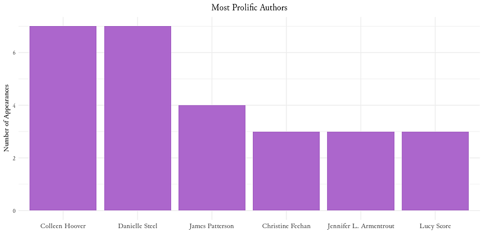
3. Prolific Authors
Group the data by author and determine the number of distinct book appearances. Filter authors with at least 3 appearances.
# Convert data type
NYT_df_combined_genre$Author <- as.character(NYT_df_combined_genre$Author)

# Identify most prolific authors based on the number of appearances
prolific_authors <- NYT_df_combined_genre %>%
  group_by(Author) %>%
  summarize(Appearances = n_distinct(Title)) %>%
  arrange(desc(Appearances))

# Filter for authors with at least 3 appearances
prolific_authors_filtered <- prolific_authors %>%
  filter(Appearances >= 3)

# Visualize
ggplot(prolific_authors_filtered, aes(x = reorder(Author, -Appearances), y = Appearances)) +
  geom_bar(stat = "identity", fill = "#AC66CC") +
  labs(title = "Most Prolific Authors",
       x = NULL,
       y = "Number of Appearances") +
  theme_minimal() +
  theme(
    text = element_text(family = "Junicode"),
    plot.title = element_text(hjust = 0.5),
    axis.text.x = element_text(hjust = 0.5, size = 11)
  )
Output:
4. Bestseller Rankings Over Time
First, let's see how the Bestsellers are ranked over time. To do this, we will calculate the top 10 most frequently appearing books based on the 'Title' column and then filter the original dataset to include only the top 10 books.
# Convert dates to Date type
NYT_df_combined_genre$PublishedDate <- as.Date(NYT_df_combined_genre$PublishedDate)

# Identify top 10 most frequent books
top_10_books <- NYT_df_combined_genre %>%
  group_by(Title) %>%
  summarize(Frequency = n()) %>%
  top_n(10, Frequency) %>%
  pull(Title)

# Filter dataframe for top 10 books
filtered_data <- NYT_df_combined_genre %>%
  filter(Title %in% top_10_books)

# Define your custom colors
custom_colors <- c("#333C83", "#FFB830", "#9ADCFF", "#C70A80", "#176B87", "#F24C4C", "#0B666A", "#8B104E", "#004721", "#563761")

# Visualize
# Visualize
ggplot(filtered_data, aes(x = PublishedDate, y = Rank, color = Title)) +
  geom_line(linewidth = 0.7) +
  labs(title = "Bestseller Rankings Over Time",
       x = NULL,
       y = "Rank") +
  theme_minimal() +
  theme(legend.position = "bottom",
        legend.box = "horizontal",
        plot.title = element_text(hjust = 0.5),
        text = element_text(family = "Junicode"),
        axis.text.x = element_text(hjust = 0.5, size = 11)) +
  scale_color_manual(values = custom_colors) +
  guides(color = guide_legend(title = NULL)) +
  scale_x_date(date_labels = "%b", date_breaks = "1 month")
Output:
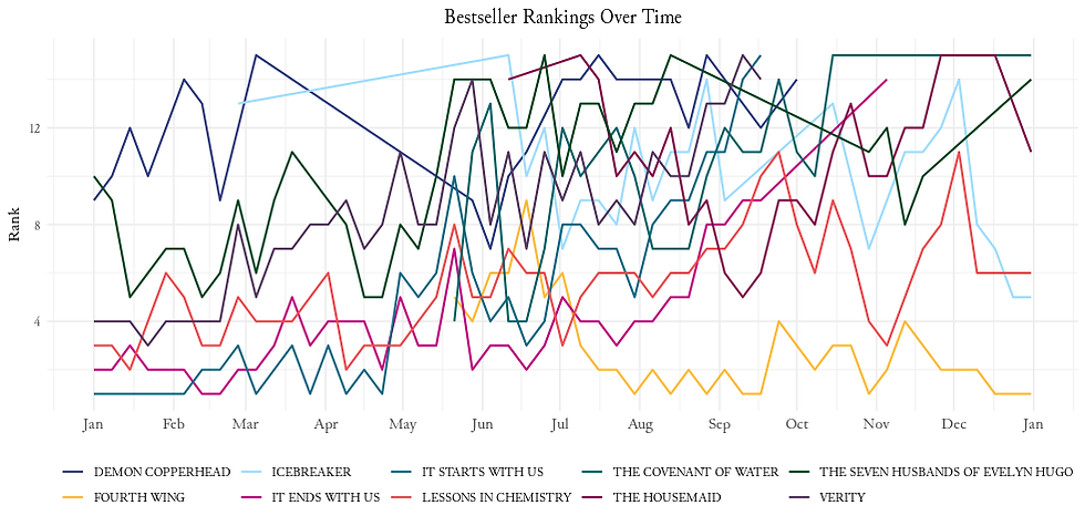
'The Seven Husbands of Evelyn Hugo' and 'Lessons in Chemistry' have been on the list throughout the entire year!
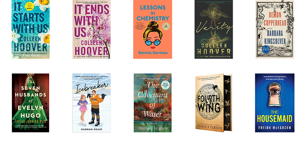
5. Book Covers
Let start by filtering and extracting the top 10 unique titles along with their associated data. We will use the rasterGrob function to convert the raw image data and combines it with the book's rank using arrangeGrob. The resulting plots are stored in a list for further arrangement. The grid.arrange function helps to arrange the generated plots in a grid with 2 rows and 5 columns.
# Create dataset containing only top 10 books
top_10_data <- filtered_data %>%
  filter(Title %in% unique_titles) %>%
  distinct(Title, .keep_all = TRUE) %>%
  slice_head(n = 10)

# Display book covers for each unique title
plots <- lapply(seq_len(nrow(top_10_data)), function(i) {

  img <- top_10_data$Image[i] |>
    readBin("raw", 1e6) |>
    jpeg::readJPEG()
  img <- rasterGrob(img, interpolate = TRUE)

  text <- textGrob(paste("Rank: ", top_10_data$Rank[i]), gp = gpar(fontsize = 12, col = "white"))

  # Combine image and text
  grob <- arrangeGrob(img, text, ncol = 1, heights = unit.c(unit(0.8, "npc"), unit(0.2, "npc")))

  # Return the combined grob
  return(grob)
})

# Arrange the plots in a grid with 2 rows and 5 columns
grid.arrange(grobs = plots, ncol = 5, nrow = 2)
Output:
Day7 of my #100daysofdata challenge.
Let me know if you have any suggestions or ideas.
Complete code available on Github.
Happy analyzing!
Comments